2024-26
Way.com
randomsite.co

Way Synchrony is a multi-platform design system created to bring consistency, scalability, and structure across Way's growing product ecosystem. Rather than maintaining one rigid library, the system was designed around a shared foundation with product-specific layers — allowing the same design principles to adapt across web, mobile, automotive, and SaaS.
Product Designer · Design System
I worked on extending Way’s existing design system to support the company’s growing SaaS and automotive products. While I was not a primary stakeholder in creating the original system, I translated its existing foundations, patterns, and principles into a more scalable structure that could work across new product environments. The goal was to establish a shared design foundation across SaaS, automotive, web, and mobile, while allowing each platform to have the flexibility needed for its specific context. This created a stronger foundation for future products and ensured the system could continue to expand as Way’s ecosystem evolved.
2+ Years
Way Design Team
Web · Mobile · Automotive · SaaS
Strategy · Foundations · Components · Patterns · Documentation · Product Integration
Background
Four products. Four environments. One brand.
Way's product ecosystem had expanded far beyond a single consumer application.
The same brand now needed to work across:
Way Web
Marketing, acquisition, partner and B2B & B2C web experiences.
Way App
Consumer-facing automotive services and journeys.
Way Automotive
In-vehicle experiences designed for Hyundai PLEOS.
Way SaaS
Complex operational platforms used by automotive businesses and teams.
Each product had evolved around its own requirements.
This created a familiar problem - Different products were solving the same design problems in different ways.


[ Core problem]
The challenge wasn't a lack of components.
It was a lack of connection.
Different products had accumulated their own:
Buttons
Different anatomy, states and hierarchy.
Typography
Different scales and usage conventions.
Cards
Different structures for similar information.
Navigation
Different approaches across product environments.
Forms & inputs
Different interaction patterns and states.
Spacing
Different visual rhythms and layout rules.
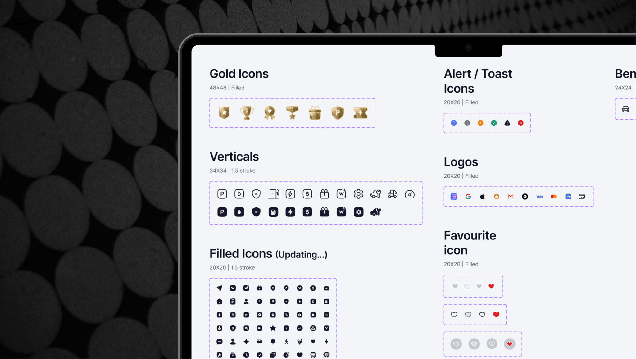
Icons
Different styles and usage conventions.
The system needed to create consistency at the foundation level while preserving the flexibility each product required.

From fragmented products to one design language
Four environments. One shared foundation.
The solution was not to force every product into one library.
Instead, Way Synchrony was structured in layers.
01 — Foundation
The core visual language shared across Way.
Color · Typography · Spacing · Grid · Icons · Elevation · Motion
↓
02 — Core Components
Reusable building blocks that could travel across products.
Buttons · Inputs · Cards · Tabs · Modals · Navigation · Tables · States
↓
03 — Product Patterns
Components combined into meaningful product experiences.
Booking · Search · Discovery · Dashboards · Forms · Maps · Data
↓
04 — Platform Adaptation
The system changes according to its environment.
Web · Mobile · Automotive · SaaS
The foundation stays connected.
The experience adapts.

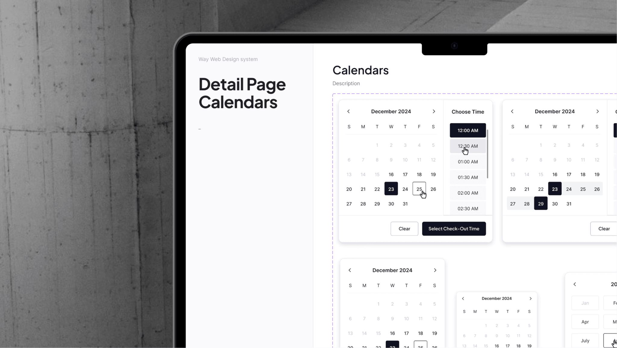
The Core System
Shared foundations. Different expressions. At the heart of Way Synchrony is a set of principles shared across all four environments.
1
Typography
A structured type hierarchy creates predictable information relationships across products.
2
Color
A shared semantic color system allows colors to communicate meaning consistently — while supporting platform-specific requirements.
3
Spacing
A consistent spacing foundation creates rhythm across everything from mobile cards to dense SaaS tables.
4
Iconography
A unified icon language connects different product experiences while supporting domain-specific automotive needs.
5
Components
Reusable components reduce repeated design decisions and create predictable interaction patterns.

The Four Systems
One ecosystem, four expressions
Way Synchrony became a framework for designing four distinct product environments.
WAY WEB
Designed for clarity and conversion.
Way Web connects users and businesses to Way's growing automotive ecosystem — across consumer services, B2B products, partnerships, and marketing experiences.
The challenge was maintaining a consistent brand and experience across pages built for very different audiences and goals.
What the system focused on
Responsive Foundations
Creating layouts and components that scale naturally across screen sizes.
Content Hierarchy
Making complex automotive offerings easy to scan and understand.
Conversion Patterns
Standardizing forms, CTAs, pricing, and key decision points.
Scalable Pages
Building reusable structures that could support new services and campaigns quickly.
The principle
Different stories. One recognizable brand.
Way Web created a flexible foundation that could grow with the business without every new experience starting from scratch.
WAY APP
Designed for everyday automotive needs.
The Way App brings Parking, EV, Gas, Car Wash, Repair, and other vehicle services into one consumer experience.
Each service has a different journey, but users shouldn't feel like they're switching between different products.
What the system focused on
Cross-Service Patterns
Sharing familiar interactions across different automotive services.
Service Discovery
Creating consistent ways to find, compare, and understand nearby services.
Transaction Flows
Standardizing key moments like selection, booking, payment, and confirmation.
Ecosystem Navigation
Making multiple services feel connected rather than added on.
The principle
Different services. Familiar interactions.
The system gave each vertical room to solve its own problems while keeping the overall experience recognizably Way.

WAY AUTOMOTIVE
Designed for the road.
The automotive system was created for Way's integration into Hyundai PLEOS.
This environment changed the rules.
The interface had to account for:
Glanceability
Critical information needed to be understood quickly.
Safety
Interactions needed to minimize distraction while driving.
Touch targets
Controls needed to be easy and safe to interact with.
Split-screen layouts
Components had to work within constrained screen configurations.
Voice interaction
Typing could be replaced with voice-driven interactions where possible.
Driving restrictions
The system needed to adapt between moving and parked states.
The visual language remained Way.
The interaction model became automotive.

WAY SAAS
Designed for operational complexity.
Way SaaS powers the businesses behind the automotive ecosystem — from repair shops and inventory teams to service operations.
Products like WayRepair span 25+ modules, connecting repair orders, appointments, parts, inventory, customers, payments, and more.
The challenge was making all that complexity feel structured, predictable, and easy to navigate.
What the system focused on
Information Density
Presenting large amounts of data without overwhelming users.
Workflow Patterns
Creating consistent ways to search, edit, filter, review, and complete tasks.
Operational Speed
Designing for people who use these tools repeatedly throughout the day.
Scalable Modules
Building patterns that could extend across 25+ modules without reinventing the interface each time.
The principle
Don't hide complexity. Give it structure.
Way SaaS became the most information-dense expression of Way Synchrony — proving that the same design foundation could scale from simple consumer experiences to complex operational products.
[Outcome]
Way Synchrony turned four independently evolving product environments into a connected design ecosystem — giving Way Web, Way App, Way Automotive, and Way SaaS a shared foundation while allowing each product to retain its own interaction requirements.
[Impact]
4 Product Systems - Unified Web, App, Automotive and SaaS around a shared visual and interaction foundation.
Shared Patterns, Less Reinvention - Established reusable components and product patterns that could be adapted instead of repeatedly redesigned across teams.
Designed to Adapt - Built a system flexible enough to support fundamentally different contexts — from consumer journeys and dense SaaS workflows to safety-critical automotive interfaces.
[Key Learnings]
The Hardest Part Was Deciding What Not to Standardize
A design system becomes restrictive when consistency becomes the goal by itself. The work showed that components should share their underlying logic and behavior, while their presentation can change when the product context demands it.
Abstraction Has a Limit
Not every recurring UI pattern deserves to become a universal component. Some patterns looked similar across products but had different jobs, constraints, or information density. The most useful abstractions were the ones that removed repeated decisions without hiding meaningful product differences.
A Design System Is a Product, Not a Library
The real value wasn't the number of components created. It was whether designers could confidently decide when to use, adapt, or avoid them. Documentation, naming, structure and usage guidance became just as important as the components themselves.
From Evidence to a Decision